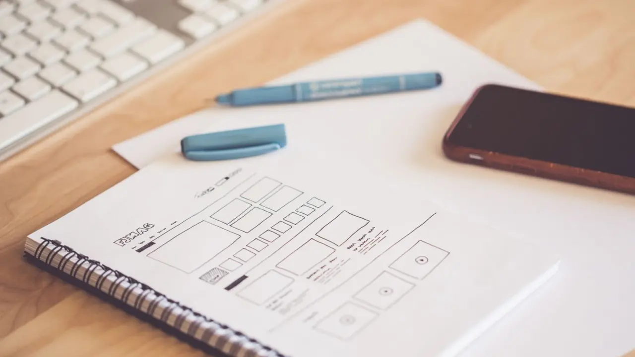
Not sure where to begin with a blank page? A website wireframe is a plain layout of your pages in boxes and lines. You write the goal, map the flow, sketch, then test it.
Wireframing is one small part of the wider craft, so if terms like hierarchy or layout are new to you, read these web design basics first.
| Item | Value |
|---|---|
| Questions to answer before opening any tool (Balsamiq) | 3 questions |
| Length of Balsamiq’s start-a-wireframe process | 6 steps |
| Length of UXPin’s concept-to-wireframe process | 5 steps |
| Paper variations per important screen (UXPin) | 3-5 variations |
These figures come from Balsamiq’s guide and UXPin’s guide. Guides get updated, so check the sources before you rely on them.
What a website wireframe is, and what it is not
A wireframe is a low-fidelity visual representation of a user interface, as UXPin puts it. It shows structure, layout and where elements sit, without colour or typography. Think of it as a blueprint, not a finished building.
It helps to keep three deliverables apart, using UXPin’s comparison:
- Wireframe: low fidelity, little or no interactivity, defines layout, structure and content hierarchy.
- Mockup: high fidelity, static, shows colours, typography and imagery.
- Prototype: low to high fidelity, interactive, simulates user flows and tests usability.
Webflow adds that wireframes come in low, mid and high fidelity. A mid-fidelity version adds detail such as CTA buttons or the types of images. For a first pass, stay low: Balsamiq calls this level “clear enough to discuss, rough enough to change”.
Write a short brief before you draw anything
It is tempting to jump straight into a tool. Balsamiq advises writing a simple brief first, answering three questions:
- Who is this project for?
- What problem does this solve?
- What is the user trying to do?
If you cannot answer these, Balsamiq says you are probably not ready to wireframe and should go back to gathering requirements. That is a useful check, because a wireframe built on guesses only hides the guesses in neat boxes.
Then give every page one goal. Webflow suggests a mission-statement style sentence for each page, such as “Engage leads and drive them to convert to paying subscribers”. Let that sentence settle every argument about what belongs on the page.
How do you map pages and flows before sketching?
Start with a sitemap. Flux Academy describes it as a simple chart that lays out the page hierarchy of a website. Paper, slides or a free online tool all work.
Uizard gives an online-shop example: the homepage sits at the top, product category pages below it, and more specific product subsections below those. From that tree you can decide which screens you actually need, for instance a homepage, a category page, a product page and a checkout.
Next, think in scenarios rather than single screens. Balsamiq suggests questions like these:
- What happens if a user clicks a button like “Next” too soon in a checkout flow?
- Where does a user land after submitting a form?
- How does a user recover if they make a mistake?
Sketch your screens in the order a user would click through them. That makes gaps in the navigation visible early, while fixing them still costs only a pencil line.
Sketch on paper, then move to a digital tool
Paper is the fastest way to try ideas. Flux Academy notes that with nothing but pen and paper you can quickly explore multiple ideas and layouts. UXPin recommends sketching 3-5 variations of your most important screens so you can compare approaches (UXPin).
A workable order for the sketching stage:
- Draw the most essential elements first: navigation menus, CTAs and sign-up forms, as Webflow suggests.
- Write in the main headlines from your content, so you can see how it will flow.
- Pick the best sketch of each screen and rebuild it in a digital tool.
- Connect buttons to their target pages to mock up the user flow.
- Check the layout for both desktop and mobile versions.
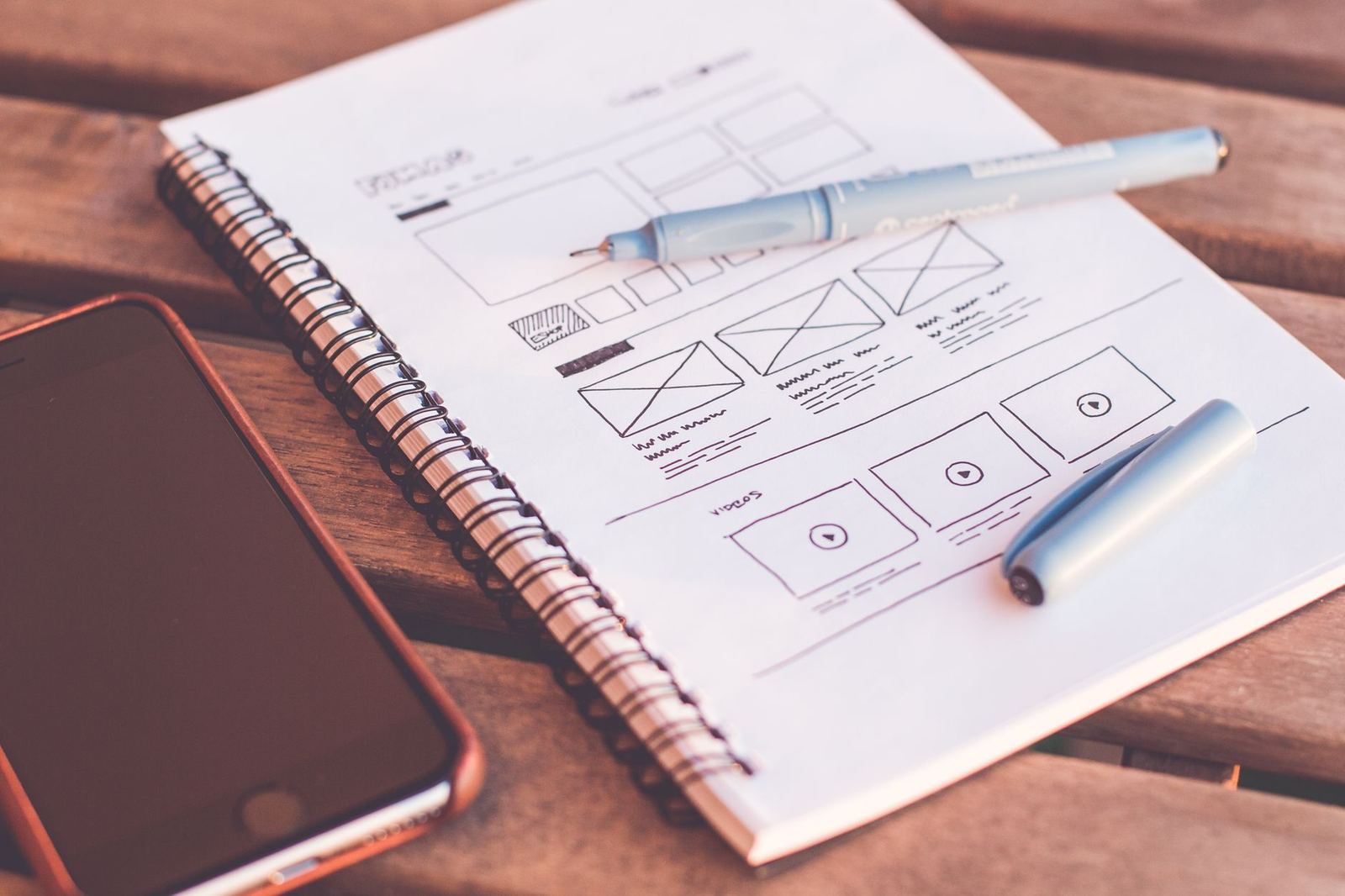
Shopify’s guide says to account for both desktop and mobile versions. If small screens are a blind spot for you, reading about mobile first design will show you why the smallest layout is often the best place to start.
On tools, Flux Academy says dedicated tools may have more features and suit collaboration, while general design tools make it easier to move on to mockups. Choose whichever you will actually finish a project in.
What to put in a website wireframe
Keep the content to placeholders. Uizard lists CTA buttons, images, snippets of text, and larger blocks for components such as headers and footers. UXPin groups the typical content like this:
- Layout structure: content blocks, columns and grid alignment.
- Navigation: menus, tabs, breadcrumbs and links.
- Content placement: headings, body text, images and CTAs.
- Functional elements: forms, buttons, search bars and modals.
Resist detail. Uizard’s advice is to avoid over-complicating the wireframe, so it stays a rough guideline for the mockup stage.
Once the wireframe is approved and you start building, a comparison of css grid vs flexbox can help you choose the right CSS layout tool for your boxes.
Test and refine before visual design
A wireframe earns its keep when someone else uses it. Shopify describes user testing as presenting real users with the wireframe, asking them to perform actions, and studying how easily they complete the task. Two quick checks from that guide:
- Ask users to summarise what they get from the wireframe at first glance.
- See what the user does first, and whether it matches the goal of the page.
For stakeholder feedback, Webflow suggests open questions such as “What attracted your attention the most?”. They give you answers you can act on, unlike “Do you like it?”.
If you are redesigning an existing site, Balsamiq suggests you start by wireframing the current version first. Annotate what is broken, then draw the improved version beside it. Flux Academy adds that approval upfront can cut down time spent on revisions later.
Frequently asked questions
What is the difference between a wireframe and a mockup?
Show answer
A wireframe is low fidelity and defines layout, structure and content hierarchy. A mockup is high fidelity and static, and it shows colours, typography and imagery, according to UXPin.
Do I have to sketch on paper first?
Show answer
No rule forces it, but both Flux Academy and UXPin recommend starting on paper. It is quick, and it stops you fussing over pixel-perfect alignment too early.
Which tool should I use for a website wireframe?
Show answer
Pen and paper are enough to begin. For the digital step, choose either a dedicated wireframing tool or a general design tool, depending on whether collaboration or an easy path to mockups matters more to you.
How detailed should my wireframe be?
Show answer
Detailed enough to discuss, rough enough to change. If stakeholders start debating colours or fonts, the wireframe has become too polished for this stage.