
Wondering where to start when your site must work on a phone and a desktop? Mobile first design means you build the small-screen layout first, then add features for larger screens. It keeps code lean and content focused.
This page sits inside the web design basics series, which covers the foundations of layout and structure.
| Item | Value |
|---|---|
| Mobile share of global web traffic, May 2026 | 50.29% |
| Desktop share of global web traffic, May 2026 | 48.24% |
| Tablet share of global web traffic, May 2026 | 1.48% |
| Example breakpoint where a layout changes | 768px |
| Code saved in one mobile-first CSS example | two lines |
The traffic and breakpoint figures come from BrowserStack’s media query guide, and the code saving from Zell Liew’s mobile-first CSS tutorial. Figures like these can change, so check the source before you rely on them.
What mobile first design means
Mobile first design means you plan and build the smallest-screen experience first, then enlarge it. In CSS terms, Zell Liew’s tutorial, published in December 2014, puts it this way: styles are applied first to mobile devices, and advanced styles and overrides for larger screens are added afterwards through media queries.
A desktop-first approach flips that order. Styles are applied first to desktop devices, and overrides for smaller screens come later. The practical difference is the kind of query you write: mobile-first uses min-width media queries, while desktop-first uses max-width ones.
Both approaches rely on media queries. MDN’s beginner’s guide describes them as a key part of responsive web design, because they let you create different layouts depending on the size of the viewport.
Why does mobile first design work?
Three reasons stand out, and each one has support in the sources below.
- Your audience is already on phones. In May 2026, mobile accounted for 50.29% of global web traffic, desktop for 48.24% and tablet for 1.48%, according to BrowserStack.
- Content gets prioritised. Noble Desktop’s tutorial describes starting with mobile styles, prioritising essential content on mobile devices, and then adding presentational elements for larger devices.
- The code stays simpler. Zell Liew notes that code for larger screens is usually more complicated than code for smaller screens, and in his content-and-sidebar example the mobile-first version saves two lines of code.
As of Noble Desktop’s April 2026 update, its tutorial concludes by advocating the mobile-first approach, citing its potential for less code and its suitability for sites with more mobile users. That second point matters: a global average is not your audience, so look at who actually visits your own site.
The traffic split is also a reminder that a desktop browser is still a large part of the picture. Mobile first does not mean desktop last; it means the larger layout is built on top of a solid small one rather than squeezed down from it.
How mobile-first CSS differs from desktop-first
Zell Liew’s basic example shows the pattern. A body is given a red background by default, and a min-width query changes it to green: the background switches at 600px and beyond. Everything below that width simply uses the base style.
The saving comes from browser defaults. In his layout example, a div has a width of 100% by default, so the small-screen version needs almost nothing. A desktop-first stylesheet has to restore those defaults inside a max-width query, which is where the extra lines come from. You can read the details in the original tutorial.
Here is how the two workflows compare in practice:
- Mobile-first: write the base styles with no query, then add min-width queries as the screen grows and override only what changes.
- Desktop-first: write the full layout first, then add max-width queries that undo or simplify it for smaller screens.
- Mixed: combine min-width and max-width when a style must apply only between two sizes.
The same tutorial is honest about the limits. Min-width queries are not the solution to every problem, and it can sometimes be beneficial to add max-width queries to help keep the stylesheet tidy. Treat mobile first as a default, not a rule that forbids exceptions.
Planning a mobile-first layout
The thinking starts before any CSS. A practical order looks like this:
- List the essential content and actions a visitor on a phone needs.
- Sketch a single-column layout that puts that content first.
- Decide how menus and links behave on a narrow screen.
- Write the base CSS for that layout without any media query.
- Add min-width queries wherever the design starts to look stretched or empty.
- Resize the browser and test each change.
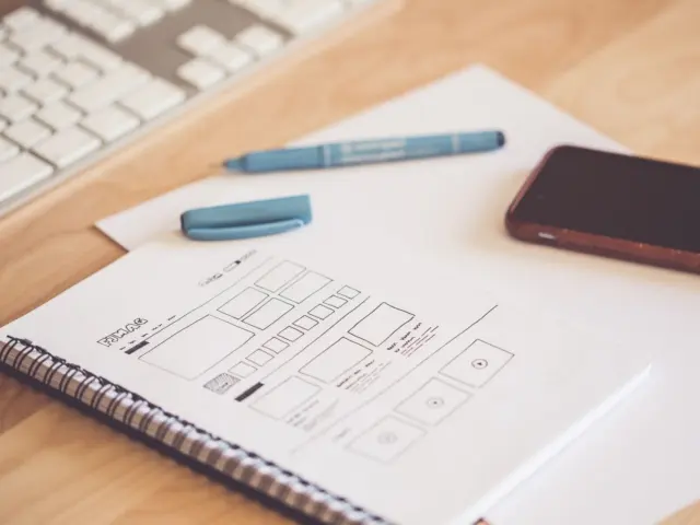
A simple website wireframe is a good way to settle the content list and the single-column sketch, because it forces you to rank content before you think about decoration.
Menus deserve the same early attention, since a narrow screen leaves little room for a long list of links, and you can read more about website navigation design before you commit to a pattern.
For the testing step, MDN notes that you can use the responsive sizing features in browser developer tools, such as Firefox Responsive Design Mode, to simulate different device widths. That lets you check each layout change without owning every device. The page is at MDN’s media query guide.
Choosing breakpoints
A breakpoint is the viewport width where the layout changes because the current design starts to break, crowd, wrap badly or waste space, as BrowserStack defines it. The media query is the CSS rule that applies new styles once that width is reached.
BrowserStack’s example uses 768px: a product grid stays narrow below 768px and switches to a wider arrangement at 768px and above. Educative’s course uses the same width, giving a container full width below 768px and adding side margins of 10% once the viewport reaches 768px or more.
Those numbers are examples, not laws. BrowserStack points out that a good breakpoint is not chosen only because a device exists at that width. Let your content tell you where it needs to change: widen the browser until the layout looks stretched, and add a min-width query there.
Frequently asked questions
What is mobile first design in one sentence?
Show answer
It is the practice of designing and styling for the smallest screen first, then using min-width media queries to add layout and features as more space becomes available.
Is mobile first the same as responsive design?
Show answer
Not quite. Responsive design is the broader goal of layouts that adapt to the viewport, and MDN calls media queries a key part of it. Mobile first is one way to organise that work, by writing the small-screen styles first.
Which media query do I use for mobile first?
Show answer
Min-width. According to Zell Liew’s tutorial, a mobile-first approach uses min-width media queries, while a desktop-first approach uses max-width. You can still add a max-width query when a style must be limited to a range of sizes, as his tutorial shows.
Does desktop first ever make sense?
Show answer
Possibly, if your own visitors are mostly on large screens. Noble Desktop’s tutorial describes mobile first as suited to sites with more mobile users, so check your analytics before choosing. Whichever order you pick, test at several widths.