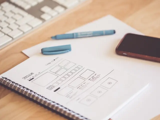

Worried visitors get lost on your site? Good website navigation design is obvious, not clever: a short, visible menu with plain labels that always shows where they are.
If you are new to the field, start with the web design basics before you tune your menus.
| Item | Value |
|---|---|
| Top-level menu items (university web guidance) | 5-7 main categories |
| Items in a single dropdown (same guidance) | 5-8 |
| Desktop sites with mediocre or poor navigation (Baymard benchmark, 2025) | 58% |
| Mobile sites with mediocre or poor navigation (same benchmark) | 67% |
| E-commerce sites that fail to highlight the current scope in main navigation | 95% |
The figures come from Ohio University’s navigation menu guidance and a Lovable guide that reports the Baymard benchmark. They can change, so check the sources before you rely on them.
Start with what navigation has to do
Navigation answers a few questions quickly: where am I, what is here, and how do I get there? NN/G’s menu-design checklist, published on June 7, 2024, calls “Where am I?” one of the fundamental questions users need to answer to navigate successfully.
That checklist lists 17 guidelines and sorts them under four headings:
- Make navigation visible.
- Communicate the current location.
- Communicate the available options.
- Make it easy to manipulate.
Ohio University’s guidance puts the idea in one line: great navigation is not about being clever, it is about being obvious. If a visitor has to puzzle over your menu, the menu has failed.
The same NN/G checklist notes that users expect to find specific menus in specific places. Working with those expectations costs nothing:
- Primary navigation sits in the header on websites.
- Utility (secondary) navigation sits above the primary navigation and search, towards the top of the screen.
- Local navigation runs along the left-hand side on desktop websites.
- The footer menu sits at the bottom of the screen and can carry extra categories for non-primary audiences, such as investor information or job lists.
How many items belong in a menu?
Ohio University’s web team advises you to limit top-level items to 5-7 main categories and to keep them from wrapping into two rows on desktop. The same page suggests that a dropdown should ideally contain 5-8 items, while admitting there is no hard number for a minimum or maximum.
Treat seven as a guide, not a law. A Lovable guide quotes Nielsen Norman Group calling it a common misconception that limited short-term memory implies menus should be similarly limited to 7 items. Menus rely on recognition: users scan the visible options and choose the best match.
A short menu still helps, because each extra item adds scanning effort. The right size depends on your site’s structure and what your visitors need.
To decide what earns a place, work through these steps:
- List the top reasons people come to your site.
- Group pages by user intent, not by how your organisation is structured.
- Put the most valuable groups in the top-level menu.
- Check that the menu mirrors how your pages are nested.
Ohio University’s guidance says to group content by user intent and to avoid organising a site by reporting structure, as the university’s own page explains.
Write navigation labels people already understand
NN/G is blunt about wording: menus are not the place to get cute with made-up words, internal jargon or abstract high-level categories. Stick to terms that clearly describe your content, features or resources.
Ohio University gives a simple test: a label should answer “What will I find if I click this?” Its example is to say “Pricing” rather than “Investment Options”, as its menu guidance shows.
These habits make labels easier to use:
- Use clear, familiar words and avoid internal jargon.
- Use action- or outcome-oriented labels where they fit, such as “Get Started” or “View Plans”.
- Left-justify vertical menus and front-load the key term, so people can scan down the first words.
- If you add icons or small images to a long menu, keep the text label next to them.
The last point matters for access as well as clarity. NN/G says both accessibility and usability demand clear text options, so pictures should support the words, not replace them.
Show visitors where they are
NN/G describes failing to indicate the current location as probably the single most common mistake it sees on website menus. Visitors often do not enter from the homepage, so the menu has to orient them, as the June 2024 checklist explains.
Breadcrumbs are one answer. The checklist cites Whirlpool as an example where breadcrumbs indicate the current location and help orient incoming visitors. They also let someone who landed on a page that is almost right jump up a single level and try another option.
The second answer is a clear active state in the menu itself. In the Baymard benchmark as reported by Lovable, 95% of e-commerce sites fail to highlight the user’s current scope in main navigation. That guide suggests combining a background colour change with a change in text weight or colour, so the signal does not rest on colour alone.
Local navigation helps when people compare related items or finish several tasks in one section. NN/G recommends showing those nearby pages instead of forcing users to pogo stick up and down the hierarchy.
A left-hand menu suits sections with a deep hierarchy, such as handbooks. Ohio University adds one warning: don’t duplicate sections already in your top menu, because that leaves people unsure where to go.
Adapt the menu to the screen
On large screens, NN/G says the hamburger menu is not appropriate: it is a necessary evil on smaller screens, but menus should not be hidden when there is plenty of space. Hidden navigation also removes context cues about who you are and what you do, according to the checklist. It names the Metropolitan Opera’s desktop site as an example, where the navigation sits under a hard-to-notice hamburger menu despite ample room.
Where you do need a hamburger icon, label it. The Lovable guide reports that NN/G found the bare icon hurt usability because users overlooked it. It also says sticky headers can help, but poor ones create more problems than they solve, for instance when they take up too much vertical space.
Open menus need care too. NN/G advises that on large screens you should not cover the entire screen when a megamenu or submenu is open, since some users will think they have landed on a new page; that guideline will probably need to be broken on mobile.
Small screens are where most visits happen. The Lovable guide cites Statista’s Q2 2025 data that mobile devices account for over 62% of global web traffic, yet Baymard’s benchmark shows mobile navigation trailing desktop by 9 percentage points, as the guide reports.
Working through mobile first design forces you to decide what visitors need first. A layout built with responsive web design then lets the same menu structure grow into a fully visible bar when the screen allows.
Frequently asked questions
How many items should a main menu have?
Show answer
Ohio University’s guidance says 5-7 top-level categories and 5-8 items per dropdown, but it also says there is no hard number. Nielsen Norman Group, quoted by Lovable, calls the strict 7-item limit a misconception, so let your content and users decide.
Is a hamburger menu ever acceptable?
Show answer
On smaller screens, yes: NN/G’s June 2024 checklist calls it a necessary evil where space is limited. On desktop, show the main categories instead, and label any hamburger icon with the word “Menu”.
What is the most common menu mistake?
Show answer
According to NN/G’s June 2024 checklist, it is probably failing to indicate the user’s current location. Use a clear active state and, on multi-level sites, breadcrumbs.
Can I use icons instead of text in a menu?
Show answer
Use them only as an extra signal. NN/G says images and icons may help with long or unfamiliar menus, but accessibility and usability both demand clear text labels.