
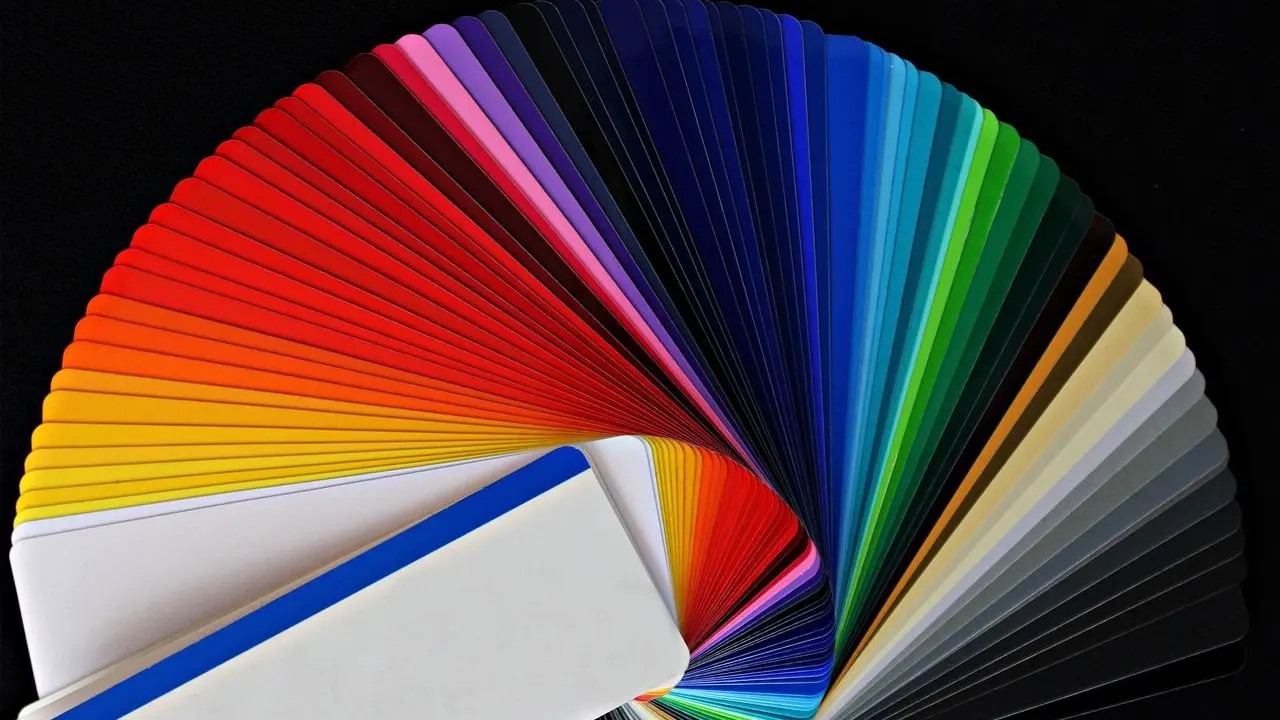
You want a palette that looks good and still reads well. Color theory for web design starts with contrast: aim for at least 4.5:1 for normal text and 3:1 for large text.
This guide is part of the web design basics series on this site.
| Item | Value |
|---|---|
| Minimum contrast for normal text (WCAG 2.2 AA) | 4.5:1 |
| Minimum contrast for large text (WCAG 2.2 AA) | 3:1 |
| What counts as large text | 18pt (24 CSS pixels) or 14pt bold (19 CSS pixels) |
| Men in the US who cannot see the average full spectrum of colors | About 8% |
| Women in the US who cannot see the average full spectrum of colors | 0.4% |
These figures come from the W3C Understanding page for Contrast (Minimum) and the Deque color-contrast rule. Standards and statistics can change, so check the sources before you rely on them.
Why contrast matters more than hue
Color wheels, harmonies and mood boards help you choose a style, but readability is decided by light and dark. The W3C explains that for people with color vision deficiency, hue and saturation have minimal or no effect on legibility, so its contrast calculation does not treat color as a key factor (W3C).
Many visual impairments also call for more light-dark contrast, whatever the color. Two pleasant colors with similar brightness can therefore make a poor text and background pair.
The audience is not small. Deque notes that about 8% of men and 0.4% of women in the US cannot see the average full spectrum of colors, and it counts low vision and colorblindness among the affected groups (Deque).
The contrast numbers to design around
The WCAG 2.2 criterion for Contrast (Minimum) is success criterion 1.4.3 at Level AA, according to the W3C Understanding page. Keep these thresholds in mind when you pick colors:
- Normal text needs a contrast ratio of at least 4.5:1.
- Large text needs at least 3:1, and the W3C page treats 18pt text or 14pt bold text as large.
- Deque converts those sizes to 24 CSS pixels and 19 CSS pixels (Deque).
- The stricter AAA level asks for 7:1 for normal text and 4.5:1 for large text (Stark).
- Graphical objects and interface components need a ratio of at least 3:1 against adjacent colors (Stark).
Treat the ratios as hard thresholds. The W3C says computed values should not be rounded, so 4.499:1 would not meet the 4.5:1 requirement (W3C).
Color theory for web design: building a palette step by step
Color theory gives you the vocabulary, but a working palette comes from decisions you can test. Work from the text outward, because a palette that starts with the reading experience rarely needs a rescue later.
Begin by listing every place where color carries information on a page: body copy, headings, links, buttons, form fields, icons and notices. Each of those is a pairing of a foreground and a background, and each pairing gets its own check. That list becomes your palette brief, and it stops you from adding a color that has no job to do.
- Fix your text and background pair first, and check it reaches 4.5:1 before you add anything else.
- Add one accent color for links and buttons, then test it against every background it will sit on.
- Check large headings separately, because they may use the lower 3:1 threshold.
- Test the states people forget. The W3C says the criterion covers placeholder text and text shown on pointer hover or keyboard focus (W3C).
- Check icons and input borders against their neighbors, since interface components have their own 3:1 minimum.
Notice what these steps leave out: they never ask whether a color is warm or cool. That is deliberate, because the W3C says contrast is calculated so that hue is not a key factor (W3C). Choose hues for personality and brand, then let differences in lightness do the reading work.
Large text gives you room to be bolder. The lower requirement allows authors a wider range of color choices for large text, which the W3C calls helpful for page design, particularly titles (W3C). A pair that reaches 3:1 but not 4.5:1 can therefore suit headings of 18pt or 14pt bold, yet it should never carry small body copy.
Placeholder text deserves a special look. The pale gray often used inside form fields counts as text, so it has to pass too, and the same goes for hover and focus styles that designers tend to add last. Test the largest areas first, since a failing page background affects everything drawn on top of it.
Keep a short list of approved pairs instead of testing from scratch on every page. Tabnav’s best practices suggest developing a style guide for text contrast and choosing color schemes with sufficient contrast for readability (Tabnav). For each approved pair, write down the ratio and the text sizes it is cleared for.
Leave some margin when you can. Thin or unusual fonts may render fainter than the CSS color suggests, so the W3C encourages authors to aim for a combination that exceeds the requirement (W3C). A pair that only just reaches the threshold on paper is a weaker choice than one that clears it comfortably.
Size and weight decide which ratio applies, so read the guide on web typography while you tune the palette.
A worked example: the footer
Tabnav gives a clear failing case: a footer with a light gray background and white text for contact information. It reports a contrast ratio of approximately 1.1:1, far below the minimum (Tabnav).
The fix in the same source is a black background with light gray text. Tabnav puts that pairing at approximately 12.6:1, which clears the requirement for all font sizes.
The lesson is simple. Two light colors will never carry text, while the same light gray on a dark background works well.
Brand colors, logos and testing
Brand palettes often hold pale or mid-tone colors. The W3C exempts text that is part of a logo or brand name, but it adds that insufficient contrast caused by corporate identity or brand guidelines is not exempted beyond logos (W3C).
Automated checks help, but they have limits. Deque’s axe rule checks for 4.5:1 for small text and 3:1 for large text, yet it does not report on text with a background image, text obscured by other elements, or images of text (Deque). Check those cases by hand.
Finally, the same palette shows up on every screen, so revisit your choices as you work through responsive web design decisions.
Frequently asked questions
What contrast ratio do I need for body text?
Show answer
At least 4.5:1 for normal text under the Level AA criterion, as described on the W3C Understanding page.
What counts as large text?
Show answer
Deque defines large text as 18pt (24 CSS pixels) or 14pt bold (19 CSS pixels), and large text needs at least 3:1 (Deque).
Does my logo have to pass the contrast check?
Show answer
No. The W3C says text that is part of a logo or brand name has no contrast requirement (W3C).
Does color theory still matter if hue barely affects legibility?
Show answer
Yes, for style and mood. The W3C notes that contrast is calculated so that hue is not a key factor, which means contrast, not hue, decides whether text can be read.